Quick Start Guide
This guide will walk you through your first analysis with Querri, from loading data to creating visualizations.
What You’ll Learn
Section titled “What You’ll Learn”In this quick start, you’ll:
- Start a new project
- Get data to analyze (synthetic, uploaded, or from your Library)
- Ask analysis questions using natural language
- View and interpret results
- Create visualizations and dashboards
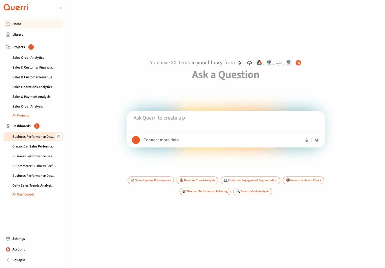
Step 1: Start a New Project
Section titled “Step 1: Start a New Project”Every analysis in Querri happens in a project. Projects are self-contained workspaces that store all your data, analysis steps, and results.
- Click the New Chat or + button
- You’ll see an empty chat interface ready for your first message
Step 2: Get Data to Analyze
Section titled “Step 2: Get Data to Analyze”You have two options for getting started with data:
Option A: Use Synthetic Data
Section titled “Option A: Use Synthetic Data”Don’t have data ready? No problem. Ask Querri to create sample data:
"Create a sample sales dataset with 100 rows""Generate example customer data for me to analyze""Make some fake ecommerce transactions I can practice with"This is a great way to explore Querri’s capabilities before connecting your real data.
Option B: Upload Your Own Data
Section titled “Option B: Upload Your Own Data”Upload a CSV or Excel file from your computer:
- Drag and drop a file into the chat, or
- Upload to the Library first, then reference it by name
Supported formats: CSV, Excel (.xlsx, .xls), JSON, Parquet
Option C: Use Existing Library Data
Section titled “Option C: Use Existing Library Data”If you’ve already uploaded files or connected data sources, the agent will find them automatically when you describe what you want to analyze.
Step 3: Ask Your First Question
Section titled “Step 3: Ask Your First Question”Once you have data (uploaded, synthetic, or from your Library), start analyzing with natural language:
Examples:
- “Analyze my sales data for Q4”
- “Show me customer trends”
- “Help me understand revenue by region”
What Happens Next
Section titled “What Happens Next”When you send your first message:
- The agent sets a goal - It translates your request into a specific analytical objective
- Finds relevant data - It searches your Library for data sources that match your needs
- Loads the data - It automatically loads 1-3 most relevant sources into your project
- Begins analysis - It starts creating steps to answer your question
Step 4: Understanding the Response
Section titled “Step 4: Understanding the Response”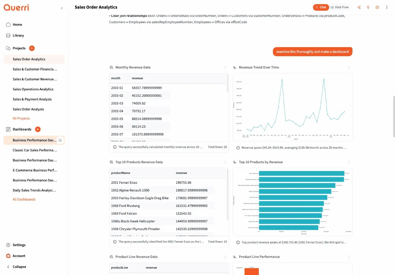
As the agent works, you’ll see several things happen:
Steps Appear
Section titled “Steps Appear”Each step represents a single operation:
- Source Load - Data being loaded from your Library
- Transformation - SQL queries filtering or aggregating data
- Visualization - Charts and graphs
- Analysis - Statistical calculations or forecasts
Steps execute in order, with each building on previous results.
QDF Tables
Section titled “QDF Tables”When steps produce tabular data, you’ll see it in the QDF (Querri Data Frame) viewer:
- Interactive scrolling and exploration
- Automatic type detection
- Sortable columns
- Download options
Agent Messages
Section titled “Agent Messages”The agent explains what it’s doing and asks clarifying questions when needed:
- “Which date column should I use?”
- “Did you want monthly or daily aggregation?”
Answer these to help the agent proceed correctly.
Step 5: Follow-Up Questions
Section titled “Step 5: Follow-Up Questions”The real power of Querri is the conversation. Build on your analysis by asking follow-up questions:
Building on Previous Steps:
- “Now filter that to just premium customers”
- “Create a chart from those results”
- “Show me the top 10”
Exploring Different Angles:
- “What if we look at it by region instead?”
- “How does this compare to last year?”
- “Break that down by product category”
Modifying Visualizations:
- “Make that a line chart instead”
- “Sort by revenue descending”
- “Add a trend line”
The agent maintains context from earlier in the conversation, so you can refine your analysis naturally.
Step 6: Creating Visualizations
Section titled “Step 6: Creating Visualizations”To create a chart, simply ask for it:
"Create a bar chart of sales by region""Show monthly trends as a line chart""Plot revenue vs. marketing spend"The agent will:
- Ensure data is in the right format
- Select the appropriate chart type
- Apply Querri’s color scheme and styling
- Generate an interactive Plotly chart
Chart Best Practices
Section titled “Chart Best Practices”For the best results:
- Be specific about what to plot: “line chart of revenue by month”
- Mention groupings if relevant: “grouped by product category”
- Request modifications after viewing: “add a trend line” or “use log scale”
Step 7: Examining Data
Section titled “Step 7: Examining Data”If you want to investigate data more deeply, just ask:
"What's in the sales_data step?""Show me statistics for the revenue column""What are the unique values in the category column?"The agent will run queries and provide detailed insights about your data structure and contents.
Step 8: Creating a Dashboard
Section titled “Step 8: Creating a Dashboard”Once you’ve created several useful visualizations, turn them into a dashboard:
"Create a dashboard from these charts""Make a dashboard with the sales and revenue charts"The agent will:
- Analyze your project steps
- Suggest an optimal layout
- Create a dashboard with 4-12 widgets
- Set up appropriate sizing and positioning
You can then share the dashboard with your team or keep it for personal use.
Common Patterns
Section titled “Common Patterns”Pattern 1: Explore → Filter → Visualize
Section titled “Pattern 1: Explore → Filter → Visualize”You: "Analyze my customer data"Agent: [Loads customer data, shows preview]
You: "Filter to customers from 2024"Agent: [Creates filtered dataset]
You: "Create a chart showing customer growth by month"Agent: [Generates line chart]Pattern 2: Compare Multiple Metrics
Section titled “Pattern 2: Compare Multiple Metrics”You: "Show me revenue and costs over time"Agent: [Creates aggregated dataset with both metrics]
You: "Plot them on the same chart"Agent: [Generates dual-axis line chart]
You: "Add profit margin as a third line"Agent: [Updates chart with calculated margin]Pattern 3: Forecast Future Trends
Section titled “Pattern 3: Forecast Future Trends”You: "Show me monthly sales for 2024"Agent: [Aggregates and displays data]
You: "Forecast the next 3 months"Agent: [Runs time series forecast, shows predictions with confidence intervals]
You: "Create a chart with historical and predicted values"Agent: [Generates chart with dashed prediction line]Tips for Success
Section titled “Tips for Success”1. Start Simple
Section titled “1. Start Simple”Begin with a basic question and build complexity through conversation:
- ✅ “Analyze sales data” → “Filter to 2024” → “Show monthly trends”
- ❌ “Filter 2024 sales, aggregate by month, create chart, and forecast Q1 2025”
2. Check Results Along the Way
Section titled “2. Check Results Along the Way”Review each step’s output before moving forward. This helps catch issues early.
3. Be Conversational
Section titled “3. Be Conversational”You don’t need formal language or SQL syntax:
- ✅ “Show me what’s going on with revenue this year”
- ❌ “SELECT revenue FROM sales WHERE year = 2024”
4. Use the Agent’s Suggestions
Section titled “4. Use the Agent’s Suggestions”The agent often offers helpful alternatives:
- “I can also show you growth rates if that’s helpful”
- “Would you like me to break this down by customer segment?“
5. Reference the Library
Section titled “5. Reference the Library”If you know the name of a data source in your Library, mention it:
- “Load the Q4 Sales Report”
- “Use the customer_database source”
What’s Next?
Section titled “What’s Next?”Now that you’ve completed your first analysis, explore:
- Core Concepts - Understand how Querri works
- Prompting Guide - Learn to write effective questions
- Working with Data Sources - Master data management
- Creating Visualizations - Build charts and dashboards
Need Help?
Section titled “Need Help?”- Review the Prompting Guide for tips on asking better questions
- Experiment! The agent is designed to handle natural conversation