Understanding Your Data
Before you can answer questions with data, you need to understand what you’re working with. Data exploration helps you discover what’s in your dataset, find quality issues early, and identify what questions your data can actually answer.
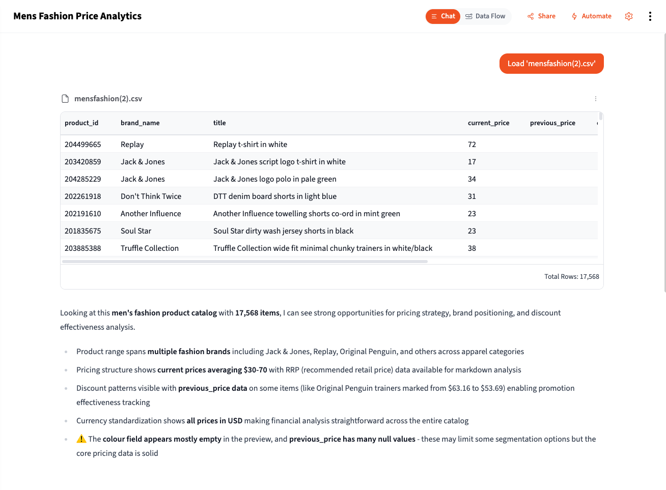
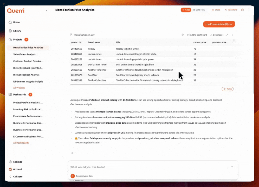
When you add data to a project, Querri automatically gives you an overview that includes row and column counts, data types, and data quality cautions—potential issues like missing values, duplicates, or unusual patterns that might affect your analysis. This immediate feedback helps you understand what you’re working with before you start asking questions.
Add Some Data to a Project
Section titled “Add Some Data to a Project”Start by bringing data into your project:
- Upload a file — Drag and drop CSV, Excel, or JSON files directly into the chat
- Connect a source — Link to databases, Google Sheets, or business apps like QuickBooks or HubSpot
- Use existing library data — Pull from datasets already in your Library
Once your data is loaded, Querri shows you a preview with basic statistics and any quality warnings it detects.
Exploring Your New Table
Section titled “Exploring Your New Table”A quick visual inspection is one of the best ways to understand what came in and spot potential issues.
Use the table controls to:
- Sort columns — Click headers to sort ascending/descending. Large values at the top? Outliers? Nulls clustering together?
- Filter values — Narrow down to specific categories or ranges to understand subsets
- Scan for patterns — Are dates in the expected range? Do amounts look reasonable? Any obvious data entry errors?
This hands-on exploration helps you form better questions and catch issues that summary statistics might miss.
Powerful Exploration Prompts
Section titled “Powerful Exploration Prompts”Once you’ve done a visual scan, use these prompts to deeply understand your data.
Multi-View Visualization
Section titled “Multi-View Visualization”One of the most powerful exploration techniques is seeing your data from multiple angles at once:
"Draw 5 different graphs to show sales trends""Create 5 visualizations showing customer distribution in different ways""Show me revenue from 5 different perspectives"This reveals patterns you might miss with a single chart—a trend line might show growth, but a histogram reveals most months are flat with a few spikes.
Dimension-Based Aggregation
Section titled “Dimension-Based Aggregation”Aggregate your data by key dimensions to surface insights:
"Group by Customer Name and calculate total revenue, order count, average order value, and days since last order""Aggregate by State showing total sales, customer count, average transaction size, and year-over-year growth""Break down by Product Category with units sold, revenue, return rate, and profit margin"These aggregations transform raw transactions into actionable summaries.
Distribution Analysis
Section titled “Distribution Analysis”Understand how your values are spread:
"Show me the distribution of order amounts as a histogram""What percentage of revenue comes from the top 10% of customers?""Create a box plot of delivery times by region"Trend Detection
Section titled “Trend Detection”Look for patterns over time:
"Show me weekly trends for the past 6 months""Compare this quarter to the same quarter last year by product""Are there any seasonal patterns in this data?"Outlier Investigation
Section titled “Outlier Investigation”Find and understand extreme values:
"Show me the top 20 and bottom 20 orders by value""Which customers have unusually high return rates?""Find transactions that are more than 3 standard deviations from average"Quick Overview Commands
Section titled “Quick Overview Commands”Get oriented quickly with these essential prompts.
What’s in this data?
Section titled “What’s in this data?”"What's in this data?"This gives you a summary including:
- Number of rows and columns
- Column names and types
- Sample values from each column
Check the size
Section titled “Check the size”"How many rows and columns do I have?"Knowing the size helps you:
- Estimate how long operations will take
- Decide if you need to filter or sample
- Understand the scope of your data
Column Statistics
Section titled “Column Statistics”Get deeper understanding of individual columns.
Numeric columns
Section titled “Numeric columns”"Show me statistics for the revenue column"This returns:
- Count: How many non-null values
- Mean: The average
- Median: The middle value (less affected by outliers)
- Min/Max: The range
- Standard deviation: How spread out values are
Understanding what statistics tell you
Section titled “Understanding what statistics tell you”| Statistic | What it reveals |
|---|---|
| Mean vs Median far apart | You have outliers or skewed data |
| High standard deviation | Values vary widely |
| Min is negative | Might be returns, corrections, or errors |
| Max is very high | Possible outliers or data entry errors |
| Count < total rows | You have null values |
Unique Values and Distributions
Section titled “Unique Values and Distributions”Understand what values exist in your categorical columns.
List unique values
Section titled “List unique values”"What are the unique categories in the status column?""Show me all the different product types"This helps you:
- Understand your categorization
- Spot unexpected values (typos, inconsistencies)
- Plan your groupings for analysis
Count by category
Section titled “Count by category”"How many orders are in each status?""Count customers by segment"This reveals:
- The distribution of your data
- Whether categories are balanced or skewed
- Potential data quality issues (too many “Unknown”)
Finding Data Quality Issues
Section titled “Finding Data Quality Issues”Catch problems early before they affect your analysis.
Check for null values
Section titled “Check for null values”"How many null values are in each column?""Which columns have missing data?"Null values can:
- Cause calculations to fail or return wrong results
- Indicate data collection problems
- Need to be handled before analysis
Find duplicates
Section titled “Find duplicates”"Are there duplicate rows?""Find duplicate customer IDs""How many unique order IDs vs total rows?"Duplicates can:
- Inflate your counts and totals
- Come from data import issues
- Indicate legitimate scenarios (multiple orders per customer)
Spot invalid values
Section titled “Spot invalid values”"Are there any negative amounts in the revenue column?""Show rows where email doesn't contain @""Find orders with dates in the future"Invalid values might be:
- Data entry errors
- System glitches
- Legitimate edge cases you need to understand
Check for inconsistencies
Section titled “Check for inconsistencies”"Show me all variations of state names""Are there different spellings of product names?"Inconsistencies like “CA” vs “California” vs “calif” will cause grouping problems.
Building an Exploration Checklist
Section titled “Building an Exploration Checklist”For important analyses, work through this checklist:
1. Overview
Section titled “1. Overview”- How many rows and columns?
- What time period does it cover?
- What does each column represent?
2. Data Quality
Section titled “2. Data Quality”- Any null values in key columns?
- Any duplicate records?
- Any obviously invalid values?
3. Distributions
Section titled “3. Distributions”- What are the unique values in categorical columns?
- Are numeric columns in reasonable ranges?
- Are there unexpected outliers?
4. Relationships
Section titled “4. Relationships”- Do key columns join properly to other data?
- Are there expected patterns (e.g., revenue increasing over time)?
From Exploration to Analysis
Section titled “From Exploration to Analysis”Exploration answers “what do I have?” Analysis answers “what does it mean?”
| Exploration finds… | Analysis might ask… |
|---|---|
| Revenue ranges from $10 to $50,000 | What’s driving the high-value orders? |
| 30% of customers are in California | How does CA performance compare to other states? |
| Sales dropped in March | What caused the March decline? |
| 5% of orders have null customer IDs | Are these anonymous purchases? Guest checkouts? |
Use your exploration findings to guide your analysis questions.
Tips for Effective Exploration
Section titled “Tips for Effective Exploration”- Start broad, then narrow — Overview first, then drill into specifics
- Use multiple views — Don’t rely on a single chart or statistic
- Question everything — If something looks odd, investigate it
- Document as you go — Note what you learn for later reference
- Don’t skip this step — Even familiar data changes over time
Next Steps
Section titled “Next Steps”Now that you understand your data:
- Filtering and Cleaning — Fix the issues you found
- How to Connect Your Data — Combine multiple datasets
- Aggregating Data — Summarize for analysis
- Working with Dates — Handle time-based data