
Dashboard settings and themes
Click empty canvas in edit mode and the properties panel holds settings for the dashboard as a whole: how tightly it’s spaced, what it’s colored with, the text drawn around the grid, and how it looks to a search engine.
Who can see this: a dashboard’s owners and editors, in edit mode. Everyone who opens the dashboard sees the result. Making and managing your organization’s themes needs an admin.
The properties panel
Section titled “The properties panel”The panel is headed Properties. Collapse it and a vertical PROPERTIES tab slides in to bring it back. Drag its left edge to make it wider, between about 270 and 600 pixels.
Which sections are open is remembered for each kind of widget, so opening Style on a table keeps it open on the next table while a chart keeps its own memory, and the panel scrolls back to the top each time you select something new.
The eight sections
Section titled “The eight sections”With nothing selected the panel shows eight sections, four of them open already.
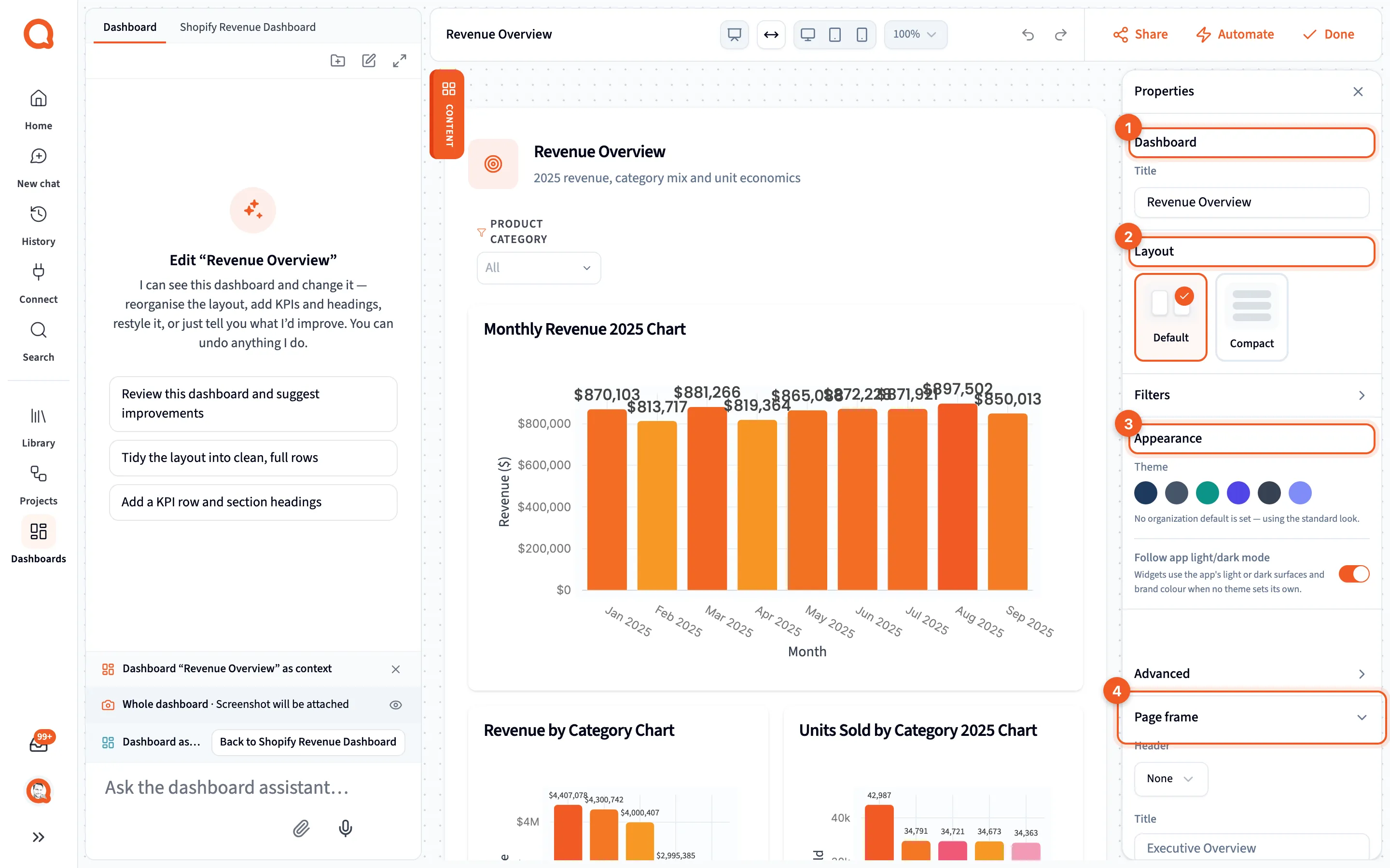
- Dashboard: the dashboard’s Title.
- Layout: Default or Compact spacing.
- Appearance: the dashboard’s theme.
- Page frame: the title, subtitle, brand line and footer drawn around the grid.
| Section | What it holds |
|---|---|
| Dashboard | Title |
| Layout | Default or Compact spacing, plus a Custom card |
| Filters | Every filter saved on this dashboard; see Filters |
| Appearance | The dashboard’s theme; see Themes |
| Advanced | Page width, colors, spacing and defaults for every widget |
| Page frame | The text drawn around the grid; see The page frame |
| SEO | Title, description and image for search and social previews |
Dashboard, Layout, Appearance and Page frame are open when you arrive; the rest start closed.
Layout’s Custom card isn’t a button. It appears only when your gap, padding and card style match neither preset, and its tooltip reads “Your own gap, padding and card style”.
Advanced holds Full width or a Max width in pixels, tagged Mobile, Tablet, Desktop or Wide as you move it; Card surface and Page background, which show the color coming from the theme and have a reset labeled Theme; Grid gap and Grid padding; and Global widget defaults, where Apply to new widgets and Apply to all widgets push the card rows onto your widgets. A control the grid gap has disabled says so in words rather than a tooltip, such as “Off while grid gap is 0”. Apply to all widgets asks first, and afterwards you get one message with an Undo that takes the whole thing back in one step.
SEO sets Page title (“Leave empty to use dashboard name”), Description and Social image URL, with a search preview and a social card preview. Its own Advanced toggle adds search engine indexing, AI crawler access, a canonical URL, the social card type and its title and description overrides, structured data and keywords.
Themes
Section titled “Themes”A theme sets the page background, the card surface, the accent, the chart series colors, the card style and how charts read. It recolors every widget at once. Text, borders and gridlines are worked out from the colors you choose, so a theme can’t come out unreadable.
- Your organization: themes your admins saved, with Brand first.
- The dot: the organization’s default theme.
- Built-in: Navy, Slate, Teal, Indigo, Charcoal and Midnight, which is the only dark one.
- The status line: which theme this dashboard is following.
Appearance shows up to two rows of swatches. Your organization lists the themes your admins saved, and Built-in lists the six that ship with Querri. A dashboard is in one of three states, and the status line says which:
- Following the organization default, which is what a new dashboard does.
- Following one of your organization’s themes, which you get by clicking a swatch in Your organization. It keeps following that theme, so an admin’s later edits reach the dashboard on their own.
- Wearing its own colors, which you get by clicking a built-in swatch or by editing a color by hand under Advanced. A hand-edited color forks the theme rather than changing it for everyone.
Use organization theme puts a dashboard back to following the default. It only appears when the dashboard has something of its own.
Separately, Use organization branding, the switch under Style in the properties panel, decides whether your organization’s palette paints this dashboard at all. Ask the assistant for a theme or a brand color and it switches that off, because the organization’s colors would otherwise override the ones you just asked for. It says so in its reply. Switch it back on to return to your organization’s palette, or ask for both at once. Follow app light/dark mode makes widgets use the app’s own surfaces and brand color where no theme sets one. A dashed ? swatch means the colors match nothing saved.
Card style cascades one setting at a time, so a dashboard with its own colors still wears your organization’s corners, shadow and border. Colors cascade as a whole palette.
The theme library itself lives in Settings → Organization → Appearance, under Dashboard themes, where an admin makes, copies and deletes themes and picks the organization default. Only admins can open it, but everyone sees the swatches here. See Appearance.
What reaches people outside the app
Section titled “What reaches people outside the app”A theme travels with the dashboard. A public share page, a widget embed and Present are all drawn with it, worked out on the server, so a dashboard that follows your organization’s default looks the same to a visitor as it does to you. A share page carries the dashboard’s page frame for the same reason; see Sharing and automating dashboards.
Only the colors and the card style travel. The theme’s name doesn’t, so a visitor never learns what your organization calls it. The canvas zoom you set while editing doesn’t either: share pages, embeds and Present are never scaled.