
Widgets and the properties panel
Dashboards are built from widgets: charts, tables and files from project steps, plus the metric cards, filters, headings, text and images you add yourself. The properties panel on the right configures whichever one you select, or the whole dashboard when nothing is selected.
Who can see this: everyone who can open a dashboard sees its widgets and can use its filters. Adding, arranging and configuring widgets is for owners and editors, in edit mode.
- Section Header: a heading over a group of widgets.
- Filter: narrows the widgets that read its column.
- A step widget: a chart from a project.
- Text block: a note.
Kinds of widget
Section titled “Kinds of widget”| Widget | Where it comes from | What it shows |
|---|---|---|
| A step widget | A project step, through Add to Dashboard, the project’s dashboard request, or a drag from the project chat | The step’s chart, table, Excel file or output |
| Metric Card | Data Visualization | One number, with an optional change badge and sparkline |
| Filter | Filters | A filter control |
| Section Header | Content | A heading, with an optional subheading and icon |
| Rich Text, Inline Text | Content | Text you type on the canvas |
| Image | Content | An image you upload or link to |
| Spacer | Content | Empty space |
| Card blocks | Content | KPIs, progress bars, lists and callouts stacked in one card |
Data Visualization holds only Metric Card. Charts and tables aren’t in the palette, because they need a project step to be worth anything; see Getting charts onto a dashboard.
The Content panel
Section titled “The Content panel”- Available Widgets: project steps added to this dashboard.
- Search widgets…: find one by name.
- Metric Card: add a number.
- Card blocks: add a card of KPIs, lists and callouts.
The panel is headed Content, with a list or grid toggle and a search box at the top. Available Widgets lists the steps added to this dashboard, each with a thumbnail and its project’s name; a check mark means it’s already placed. Drag one onto the canvas to place it. Its trash icon, Remove widget from library, removes an unplaced widget from the dashboard without asking. A dashboard with none says “No widgets available. Add steps to your project to create widgets.”
Below it, the widgets you add by hand are grouped as Data Visualization, Filters and Content, each with a short description under its name. Click one to add it, or drag it where you want it. Clicking also selects it and opens its settings.
Arranging widgets
Section titled “Arranging widgets”Click a widget to select it and see its settings; press Esc to deselect. Its pill names what it is, such as Chart or Card blocks, and carries Duplicate and a delete button named for the widget, such as Delete Chart. The Delete key does the same.
Drag the handle to move a widget, or drag the seam between two side-by-side widgets to resize them. A readout follows the cursor while you drag: 5 + 7 of 12 columns on a seam, or a height in pixels on a row edge. Resize row height sets a row’s height.
Removing anything raises a message naming what went, such as “Chart removed”, with an Undo beside it. Undo also puts back the panel row that was open. Titles you edit on the canvas take Enter to save and Escape to cancel, and neither key reaches the canvas underneath.
In edit mode, a step widget also has Open data source in the Ask panel, which opens its project as a tab in the chat panel rather than taking you away from the dashboard. A narrow card shows Project, Expand and Download as icons rather than words, so they stop covering its title.
Widget settings
Section titled “Widget settings”The panel’s own controls, and the settings for a dashboard as a whole including its theme, are on Dashboard settings and themes.
Select a widget and its sections run in a fixed order: Header, then the widget’s own section, then Data, Layout, Style and Share. Which of them appear depends on the widget. When the widget came from a project step, a line above them reads Original: and the step’s name.
| Widget | Its sections |
|---|---|
| A chart drawn from data | Header, Chart, Data transforms, Data, Layout, Style, Share |
| A chart that is a picture | Header, Chart, Data, Layout, Style, Share |
| A table or other step widget | Header, Table, Data, Layout, Style, Share |
| An Excel file | Header, Excel, Data, Layout, Style, Share |
| Metric Card | Metric, Data, Layout, Style |
| Rich Text, Inline Text | Text, Layout, Style |
| Image | Image, Layout, Style |
| Spacer | Layout, Style |
| Section Header | Header, Layout, Style |
| Card blocks | Header, Blocks, Layout, Style |
| Filter | Filter, Layout, Style |
A metric card has no Header and no Share. The widget’s own section opens first; Header opens only when there isn’t one.
Header sets the widget’s Title and its Heading style, from Heading 1 to Heading 4. On a chart or table it also has Alignment, a Show header switch, and an Extra options switch that reveals Subheading, Show icon and Icon. On a Section Header widget it has Position instead of Alignment, and Show subheading and Show icon are always there.
Data names where the widget reads from. Data source type is Sample data or Project step; a project step has Project and Step pickers, each with its own Retry for a list that didn’t load, and Open in Ask panel, which opens that project as a tab in the chat panel. A widget whose step has gone says “This widget’s project or step is no longer available.”, names what it last used, and offers Choose another step or Use sample data. Sample data is edited here, under Presets, Import or JSON.
Layout owns size: Width in columns, from 1 to 12, Start position, and Height in pixels. Start position and height default to auto, and once you set one an Auto button puts it back. An image also gets Full size with a width and height in pixels.
Style holds the card rows: Card style, Drop shadow, Background (Theme, None or Custom), Border width, Radius, Border color and Card padding. Below them, while card style is on, Use organization branding says whether it’s inheriting from the dashboard or overridden, with a Reset.
- Dashboard default: this row is following the dashboard.
- Overridden: this row was set on the widget.
- Card style: the card around the widget.
- Background: Theme, None, or a color of your own.
Every card row carries a small Dashboard default or Overridden pill, so you can see at a glance what this widget changed.
Share publishes the widget on its own. See Widget embeds.
From chat, and Revert
Section titled “From chat, and Revert”A row the dashboard assistant changed is marked From chat, with a Revert beside it. It shows on the Style card rows, on Layout’s Width, Start position and Height, and on a chart’s Show legend, Show grid, X-axis title, Y-axis title and Legend position.
The marker looks after itself. It disappears as soon as the value stops matching what the chat wrote, so your own edit, a drag on the canvas or an undo clears it. Revert puts the previous value back and saves it like any other change you make here. See The dashboard assistant.
Charts
Section titled “Charts”- Interactive chart: draw it as a live chart rather than a picture.
- Show legend: one of the settings at the top of the section.
- The five groups: everything else about the chart, with a count of what you changed.
- Data transforms: shape the data before it’s drawn.
The Chart section opens with Interactive chart, a Toolbar switch list (merge the title into the toolbar, open the project, download as an image, expand), a Toolbar style of Bar or Pills, and Show legend. A chart that is a picture instead says “This chart is a picture, not chart data. Styling and interactive options need real data.” and offers Connect data.
Below that sit five groups. They’re closed on arrival, one opens at a time, each shows a summary when closed, and each carries a badge counting how many of its controls you’ve changed.
| Group | What’s in it |
|---|---|
| Appearance | Colors and palettes, backgrounds, title and label sizes, markers, opacity, borders, corner radius, bar and group gaps, and a watermark |
| Axes | Gridlines, axis labels and titles, scale, minimum and maximum, fill or aspect ratio, margins, and a secondary Y-axis |
| Interaction | Hover, spike lines, legend position, which toolbar buttons show, a range slider and quick ranges, and animation |
| Annotations | Horizontal and vertical reference lines, and text notes with arrows |
| Export | Download format and resolution |
Controls a chart type can’t draw are hidden rather than greyed out, so Marker size isn’t there on a bar or histogram chart. A chart with no axes says so in Annotations rather than offering lines it can’t place.
Data transforms shapes the data before the chart is drawn, and it’s there on any chart drawn from data. Across the top are the presets Top 10, Clean, 100% and Running, with a Suggested: row. Below them, nine transforms run top to bottom in three fixed stages: Filter, Time bucket and Aggregate; then Outliers, Smooth, Sort and Limit; then Normalize or Cumulative, whichever you pick. Each has a switch and a help tooltip, they can’t be reordered, and switching one off leaves it in place. Reset turns them all off, with an Undo.
Metric cards
Section titled “Metric cards”Metric holds Metric label, Display type (from the data, a single value, or with a sparkline, a trend or a comparison), Size (Big, Compact or Inline), then Icon, Icon position (Beside label or Left of value) and Icon color, then Value format (Prefix, Decimals, Suffix and Unit), Show % change badge, Trend direction (which way is good, which colors the arrow without turning it), Change label and Footnote.
Which number the card reads is in Data, under Value mapping: Value column, Aggregation (last or first value, sum, average, minimum, maximum or row count), Compare against, Comparison column, Sparkline column and Label from column.
Card content is aligned to the top, so a row of cards lines its labels up. The sparkline is drawn as a line over the data’s own range, with the current period picked out in the accent color. An icon left of the value sits in a filled circle, which is dropped on a card narrower than about 160 pixels so the number keeps its room.
Tables, Excel files, text, images and card blocks
Section titled “Tables, Excel files, text, images and card blocks”- Table: Display mode (Table or Description), a Toolbar switch list, a Toolbar style of Bar, Pills or Floating, then Rows with Show index column and Show row expand button.
- Excel: a Toolbar switch list only. Its title and header are set in Header above.
- Text: rich text is edited on the canvas, and the panel sets its alignment.
- Image: Upload Image or or paste URL, Alt text, Image fit (Fit inside, Fill and crop, Stretch, Original size or Shrink to fit) and Position.
- Card blocks: a numbered list of the blocks in the card, a Two columns switch with Right column starts at block, and a picker at the bottom with Add block. There are 13 kinds, among them a KPI tile, a progress bar, bar and ranked lists, a checklist, a callout, status pills, text and a divider.
Icons anywhere in the panel come from one searchable picker. Its search matches meaning as well as name, so “money” finds a dollar sign, and there’s a No icon row where clearing makes sense. The tinted square on a section header or a chart header, labeled Change icon, opens the same picker on the canvas.
Filters
Section titled “Filters”Filters are widgets on the canvas. Each one narrows the widgets whose steps read its column.
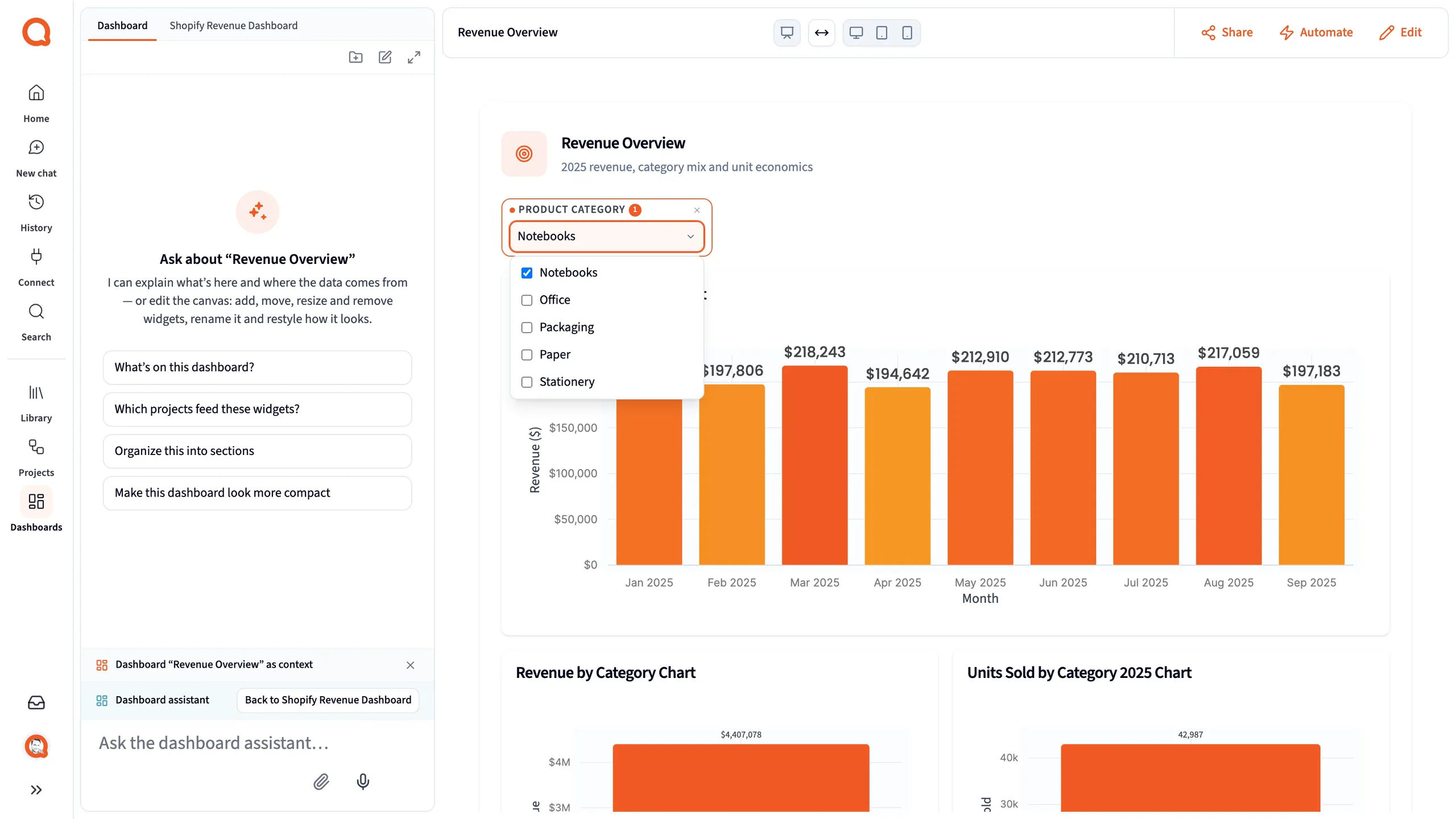
- The filter: choose values.
- Clear filter: show everything again.
There are five types: Multi-select, Single select, Date range, Numeric range and Text search. A type that doesn’t suit the column is unavailable, and its label says why, such as “needs a number column”.
Adding a filter
Section titled “Adding a filter”- In edit mode, drag Filter onto the canvas. It reads “Configure this filter in the properties panel” until you do.
- In the Filter section, pick the Column. A line below estimates how many widgets it affects, such as “Affects 3 widgets”, and lights them up on the canvas.
- Check the Display label, and choose a Filter type.
- Click Save. Discard puts the fields back.
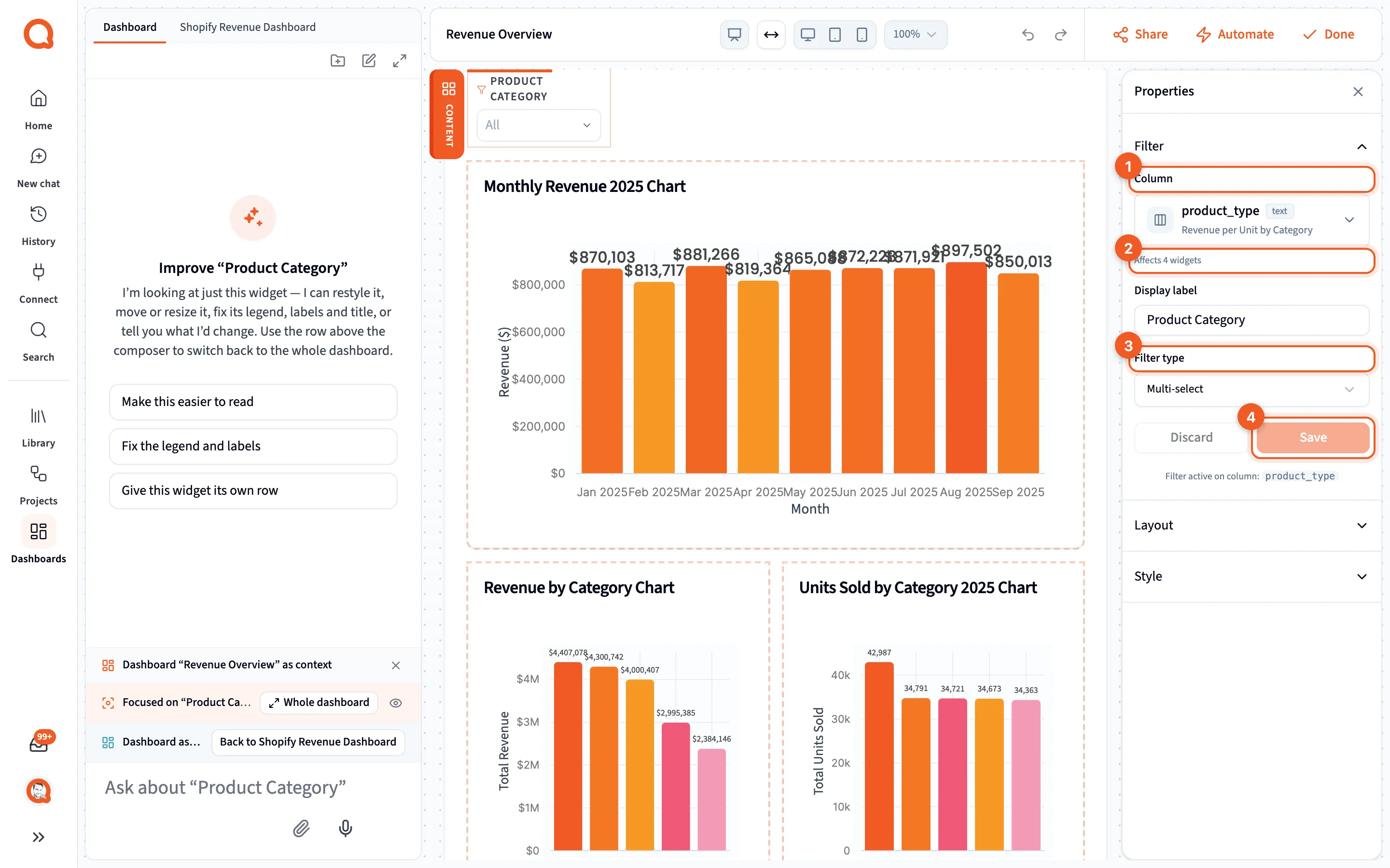
- Column: the column to filter on.
- The impact line: which widgets it’s expected to change.
- Filter type: how people pick values.
- Save: apply it to the dashboard.
While you have unsaved changes the section header carries an Unsaved pill and a warning inside it. If the column list can’t be loaded, Column becomes a plain text box with a Retry. A save that fails says so and asks you to try again.
That impact line is only an estimate. A filter changes just the widgets whose steps read its column, and filtering a chart that ranks, limits or shows shares of a total can change what its numbers mean. The dashboard assistant can tell you which columns are safe to filter on.
A control whose filter has been deleted says “This control’s filter no longer exists, so it filters nothing.” and offers Recreate filter, which rebuilds the definition from the fields on screen.
How a filter looks
Section titled “How a filter looks”A filter’s Style section sets Style to Box with label or Pill, plus Uppercase labels and a Font size. A pill is a single rounded chip that says what’s chosen: Location: All when nothing is, the value itself when one is, Location: 2 selected when several are, and the range itself on a date or number filter. Click it to open the control, with a Clear when something is set.
Every filter on the dashboard
Section titled “Every filter on the dashboard”The Filters section, with nothing selected, lists each filter on the dashboard with its column, its type and how many widgets it affects. A chip reads On canvas, or No control with a Place control button for a filter nobody can reach. Removing one asks first, and says that its control on the canvas goes with it.
Whose choice sticks
Section titled “Whose choice sticks”When an owner or editor changes a filter, the choice is saved, and the dashboard opens with it for everyone. When a viewer, or someone on a public link, changes a filter, the choice stays in their browser. A public link can also lock filters or hide them; see Public links.
If you’re an editor, clear a filter you only set to check something.
When a widget doesn’t load
Section titled “When a widget doesn’t load”- Applying security filters: Querri is applying your access rules first. See Dashboard security.
- Updating: a filter change is refreshing the widget.
- Failed to load widget data: the step’s data couldn’t be loaded.
- Data Source Required: the widget isn’t linked to a step.
- No data available: the step returned no rows.