
Appearance
Appearance Settings covers how Querri looks: your in-app theme, your organization’s branded sign-in page, and how chat shows results for everyone in your organization.
Who can see this: admins only.
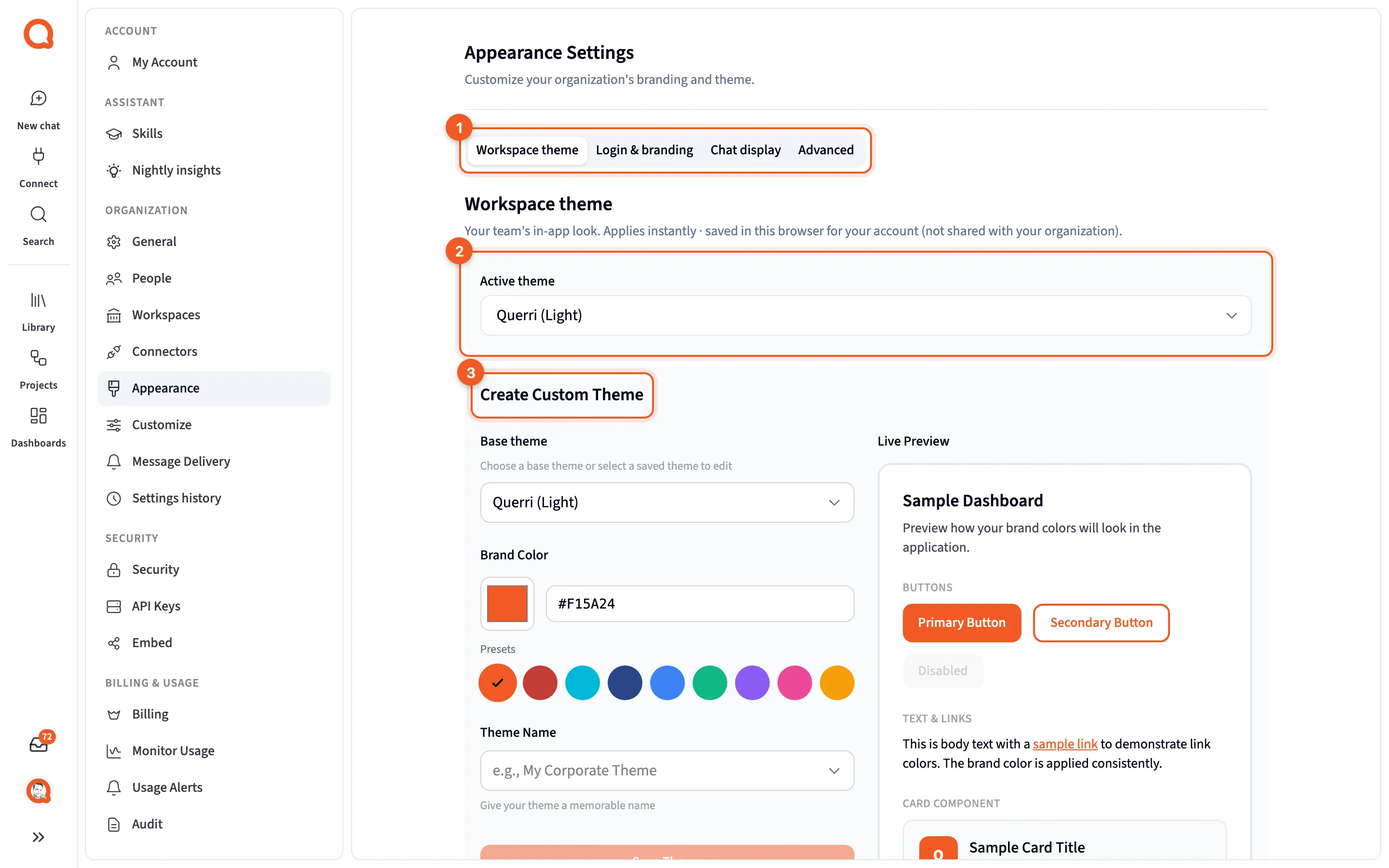
- The tabs: Workspace theme, Login & branding, Chat display and Advanced.
- Active theme: the theme you’re using.
- Create Custom Theme: the theme builder.
The page has four tabs: Workspace theme, Login & branding, Chat display and Advanced. Only the first is personal. Login & branding, Chat display and Advanced change things for the whole organization, and you save them with the bar at the bottom of the page.
When a brand drafted from your website is waiting for review, a banner at the top says so.
Workspace theme
Section titled “Workspace theme”This tab sits on an admin page, but it’s personal. A change applies straight away and is saved in this browser for your account, not shared with your organization.
- Active theme: Querri (Light), Night (Dark), any themes your provider adds, and your custom themes. It switches the moment you pick one.
- The theme builder, for making your own.
- Generate from your website: enter your site’s address to build a theme from it. It appears only for accounts set up for a company, not for personal use.
When your organization’s brand color is applied, a Workspace brand active card says so, with Customize.
Login & branding
Section titled “Login & branding”This is what people see when they sign in through your organization’s branded sign-in link, which you set on General. These settings apply to the whole organization, so use the save bar when you’re done.
- Full Logo and Square Logo, each with a preview and Remove. The square logo is “Also used as the in-app browser-tab favicon for your organization.”
- Branded login URL: your organization’s URL name, read-only. Set or change it on General.
- Login page colour theme.
- Login template: Showcase, Classic (picked until you choose), Spotlight, Window or Split, each card with a one-line description.
- Show artwork panel, which applies to one template only, and Google One Tap prompt.
- Live preview of the sign-in page.
- Login background image.
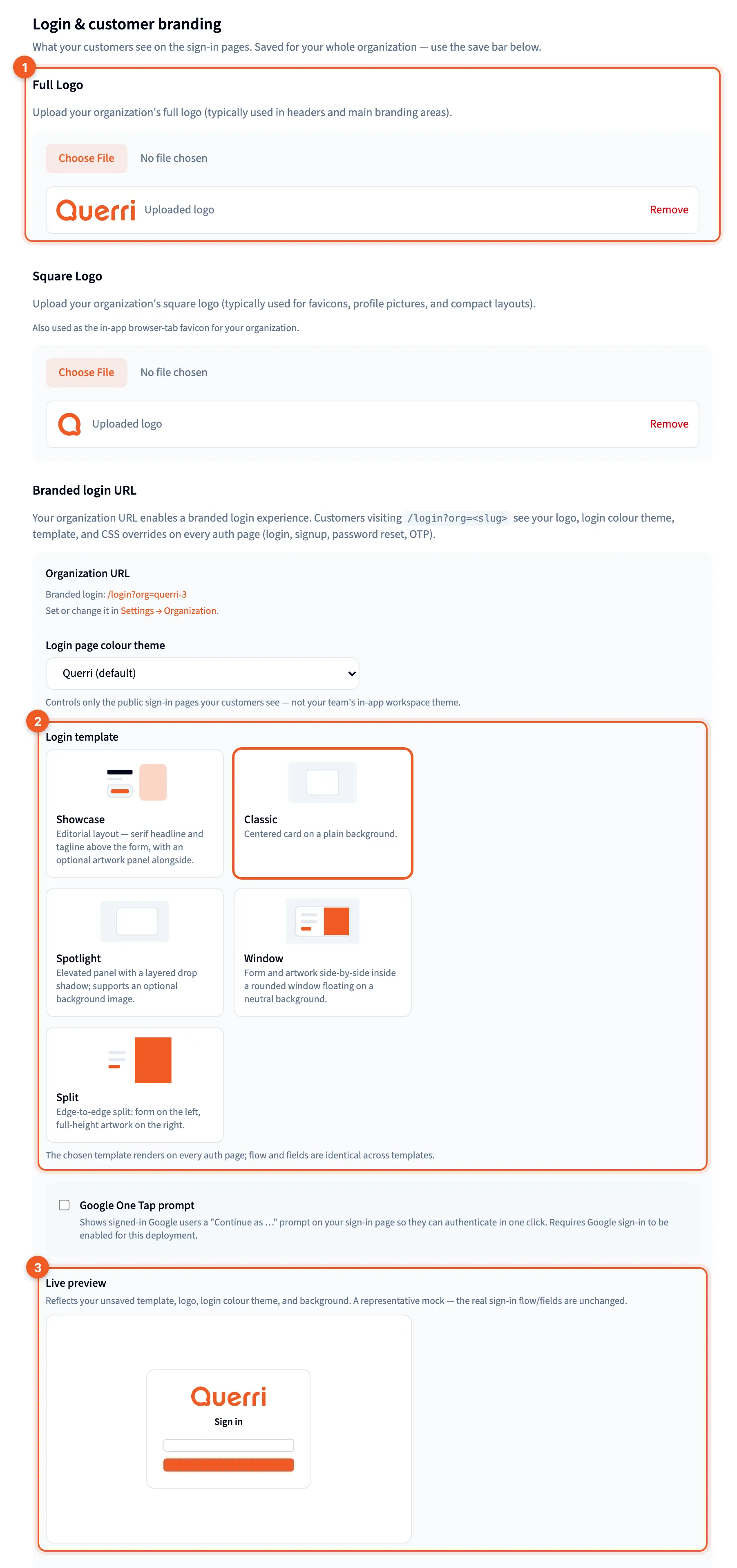
- Full Logo: your logo for the sign-in pages.
- Login template: the layout.
- Live preview: how the sign-in page will look.
Chat display
Section titled “Chat display”Settings on this tab affect everyone: “How AI chat renders step results and responses for everyone in your organization. Embedded analytics can still override these per embed via the SDK config.”
- Step results: Full, where tables and graphs show at full size; Minified, compact result cards you can expand; or Hidden, with no step results in chat.
- Show tables, Show graphs and Show reasoning: untick one to keep it out of chat.
- Final response above results: puts the written answer above the tables and graphs, even though those are made first.
If teammates tell you chat has stopped showing tables or reasoning, check this tab first.
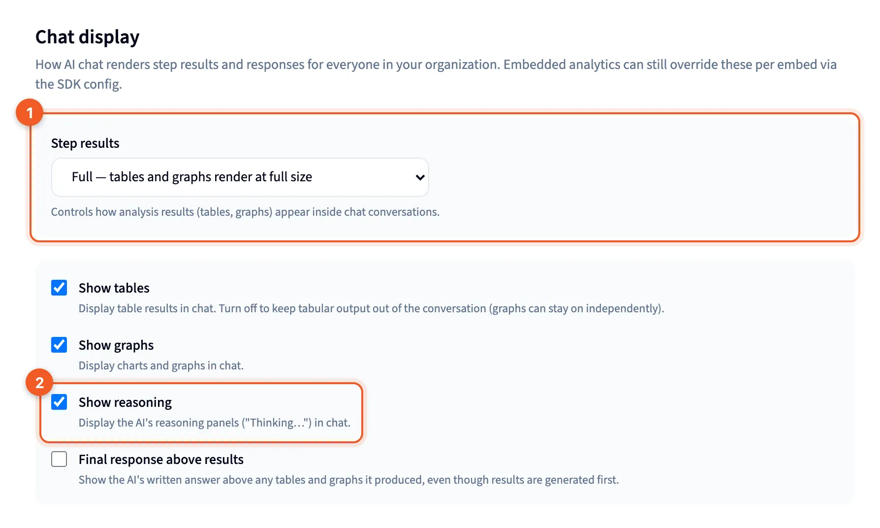
- Step results: how much of each step chat shows.
- Show reasoning: whether reasoning appears in chat.
See Chat and the Librarian, Project chat, and Embed SDK for per-embed overrides.
Advanced
Section titled “Advanced”“Power-user customisation for the branded login experience. Optional.” You’ll find an advanced theme editor, then CSS Overrides, a box for your own CSS with a character counter.