
Visualize
Visualize shows your Library as a map, so you can see how everything in it connects.
Who can see this: everyone who can open the Library, when Visualize is turned on for your organization. It isn’t offered on the Shared with lists.
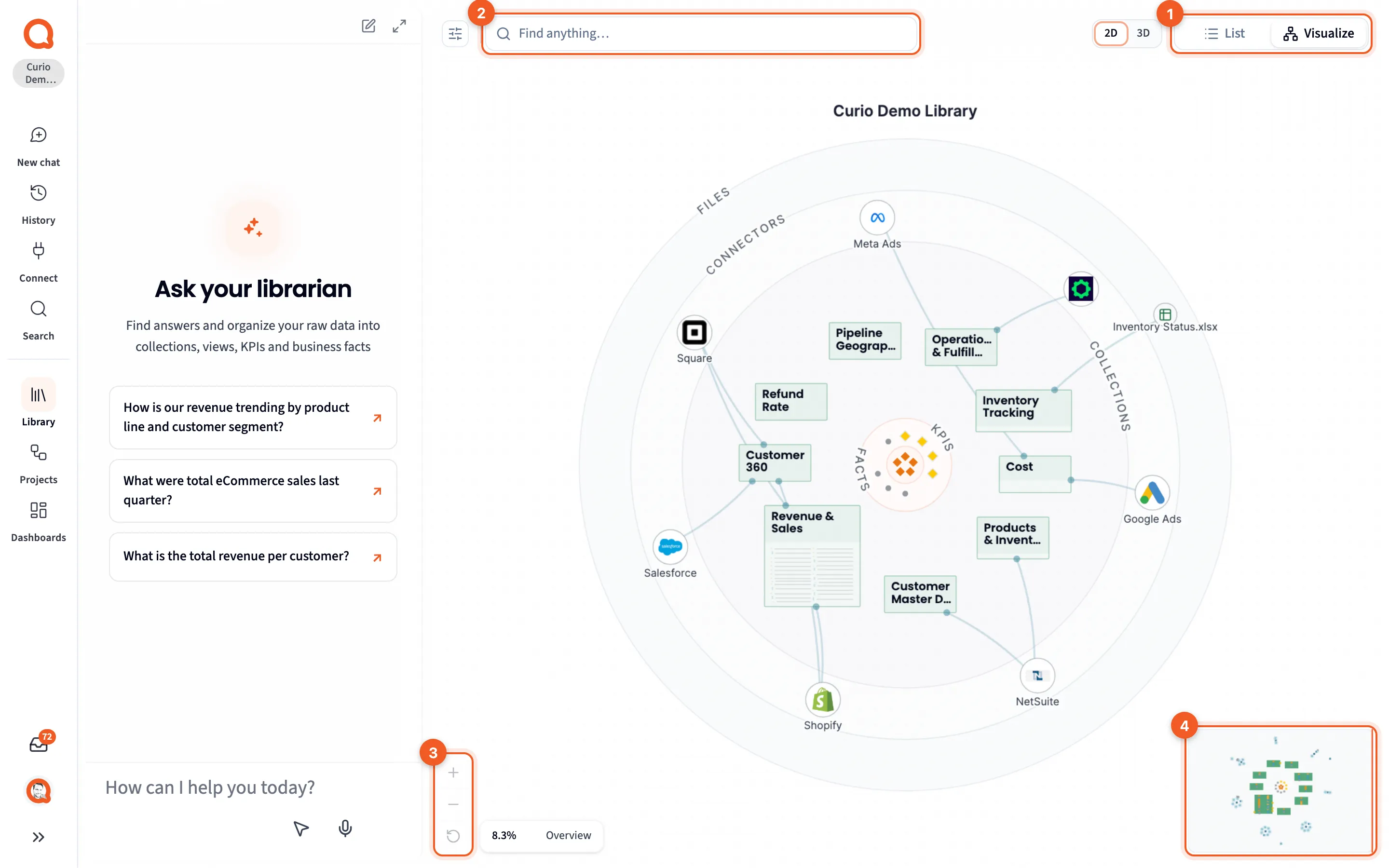
- List | Visualize: tables or the map. Querri remembers your choice in this browser.
- Find anything…: jump to an item or light up a topic.
- Zoom in, Zoom out and Reset layout.
- The minimap: click or drag it to move.
Click Visualize in the section bar. Drag the background to move around, and scroll or pinch to zoom.
Reading the map
Section titled “Reading the map”Raw data is on the outside and meaning is in the middle. Files and connectors ring the edge, collections form the next ring in, and KPIs and facts cluster at the center.
| Item | How it looks |
|---|---|
| Collection | A box with a tinted header. Its questions and views are rows inside |
| Question | An orange row in its collection |
| View | A blue row under the question it answers, or a card outside a collection |
| KPI | A yellow diamond. Categories such as Efficiency are orange diamonds |
| Fact | Grey: a note row in a collection, a small dot beside one item, or a free dot when it’s about several |
| Monitor | A heartbeat mark beside the view it watches, with a count when it has alerts |
| Connector | A white disc with its logo, and lines to the collections it feeds |
| Uploaded file | A white disc with a table icon, colored by file type |
| Source table | A teal dot, with its columns as pale dots around it |
Up close, a view row shows its columns as a strip of ticks colored by type. An amber dot means it’s still building, and a red one means the build failed.
Most lines are faint grey. Green lines join tables that share a key, which Querri works out when your data arrives. Green also joins a fact to what it’s about.
Zoom levels
Section titled “Zoom levels”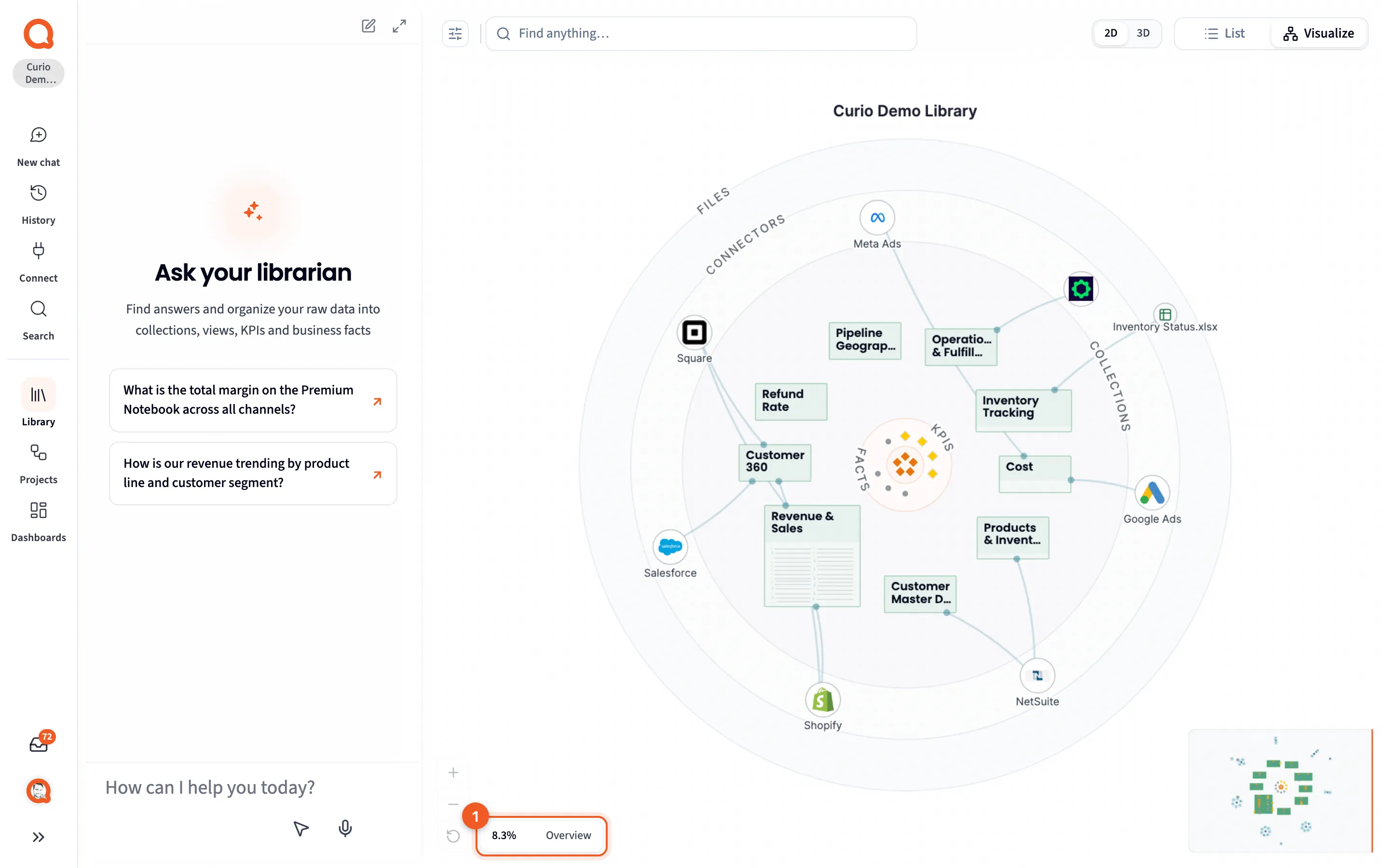
- The zoom readout: how close you are, and the level’s name.
| Level | Zoom | What appears |
|---|---|---|
| Overview | below 18% | Collections with miniature rows, connectors, uploaded files, KPIs and facts |
| Browse | 18% to 45% | Source tables, columns and thin lines. Collection rows become readable from 36% |
| Detail | 45% to 150% | Names on items |
| Close | 150% and up | Names on lines, such as the keys two tables join on |
A small Library shows detail sooner than the readout’s name suggests. Reset layout fits everything and puts back any items you dragged. Once you’ve clicked the map, f fits it, + and - zoom, and the arrow keys pan.
Finding and highlighting
Section titled “Finding and highlighting”In Visualize, Find anything… replaces the section tabs. Pick an item by name to open its panel, or choose Zoom to to light up a topic. Search covers the search itself.
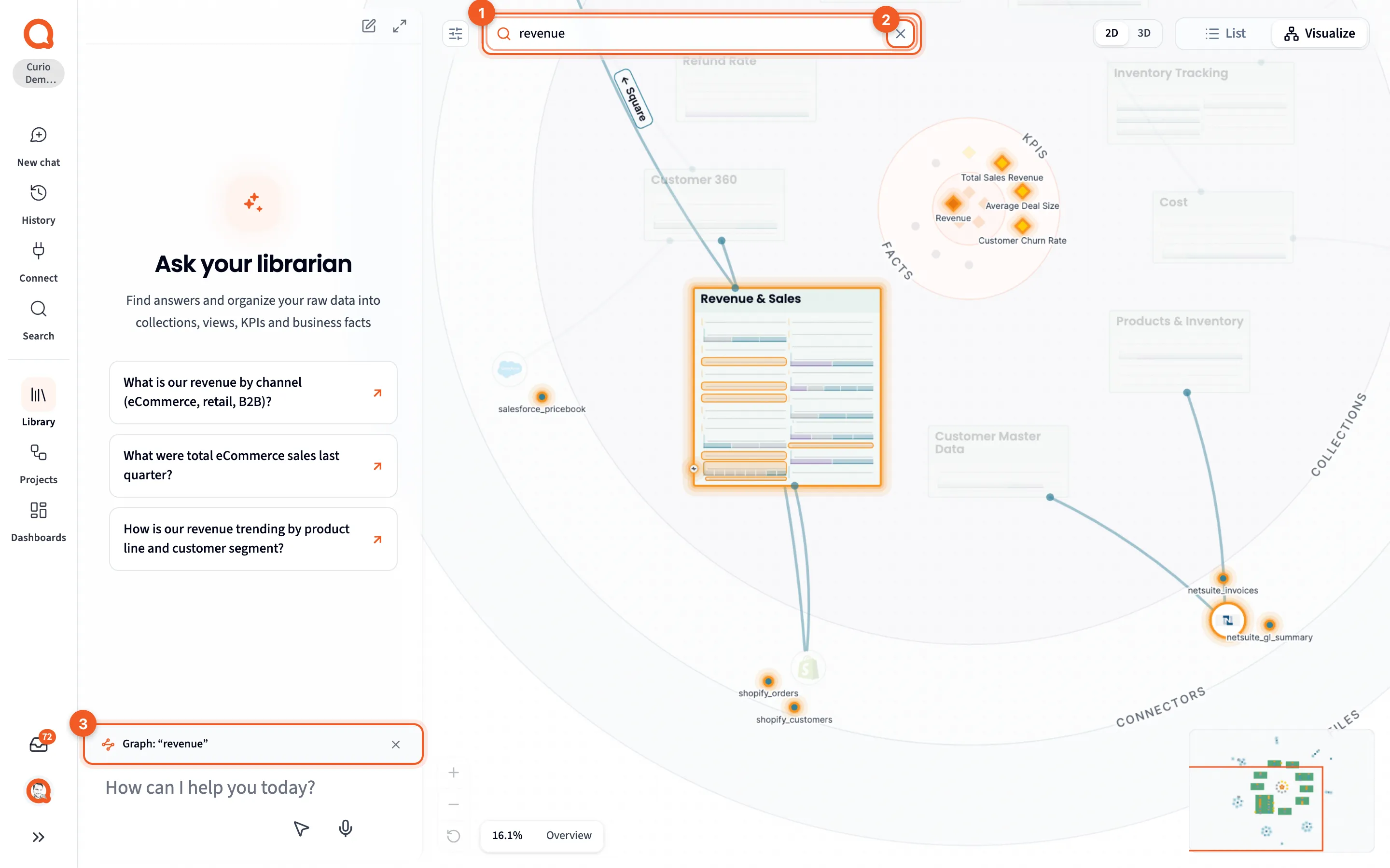
- The search: what’s lit.
- ×: clear the highlight.
- Graph: “revenue”: what it found, added to Librarian chat as context.
Direct hits glow orange, their neighbours a paler orange, and the rest dims. For “revenue” that’s Revenue & Sales, three KPIs, the Revenue category and five tables. In 2D, hits show at every zoom level.
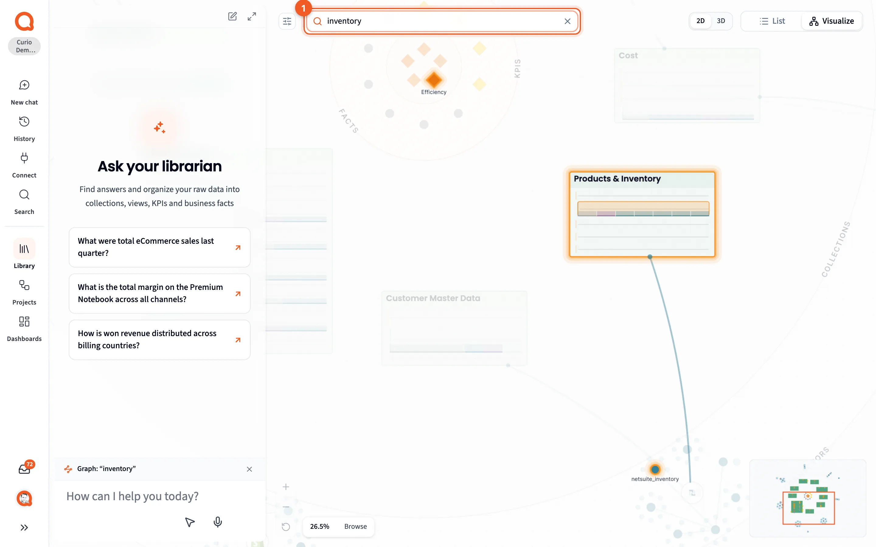
- The search: “inventory”.
A narrower topic lights less, here one collection, one category and one table. Clear a highlight with ×, Clear in the list, or Esc.
The map also lights up while the Librarian searches your Library, if Visualize is open. Afterwards, expand the answer’s route row to light those items again. See Reading an answer.
Hover cards
Section titled “Hover cards”- The hover card: a quick look.
- Click for details.
Point at an item and everything unrelated fades. A card shows its kind, name and summary, a few details such as a KPI’s State, and when it was updated. On a column tick in a view row, it shows that column’s name and type, a small chart of how its values are spread, and its Populated, Missing and Unique values counts, with Minimum and Maximum for a number column and a few sample values.
Opening an item
Section titled “Opening an item”- The item you clicked.
- Its details.
- Open topic: find it in the Library.
- ×: back to the map.
Click an item to open its panel on the right, the same one you’d see in List: Detail panels, the KPI panel, Table and column panels or the monitor panel. A column tick opens its column. Selecting an item adds it to Librarian chat as context. Esc clears the selection, and Shift-drag selects several.
Filters
Section titled “Filters”- Scope.
- Node kinds.
- Edge relations.
- Reset graph filters.
Dock the browse panel and open Filters to show less.
- Scope: Scoped, the default, shows this workspace’s items and what they connect to. Whole graph shows your organization’s whole map.
- Node kinds: a checkbox, color and count for each kind, so it doubles as the map’s key. Anchor Q and Refining Q are questions, and Series are columns. Files you’ve stored start unticked, so they stay hidden until you tick them. Uploaded data files still show as discs.
- Edge relations: each kind of line, by its internal name.
references, the links between tables, starts highlighted. Click a row to cycle it through faint, highlighted and hidden. - Reset graph filters ticks every kind, files included, and puts the lines back to their defaults. Reloading the page does the same but leaves files unticked. Neither changes Scope, which this browser remembers.
2D and 3D
Section titled “2D and 3D”3D, beside 2D, turns collections into round platforms on a slowly turning stage, with Pause to stop it. Stay in 2D for real work: 3D has no zoom readout, and its highlights don’t show at every level.