
Visualizations
Esta página aún no está disponible en español. Se muestra la versión en inglés.
You don’t build charts by hand in a project. You describe the chart you want in project chat, and the project adds a Visualization step that draws it from a table it already has.
Who can see this: anyone who can open the project. Changing a chart needs editor access.
Asking for a chart
Section titled “Asking for a chart”- The chart: click it to open it full size.
- Download: PNG or SVG.
- Refine: change it by describing what you want.
Say what to plot and how, such as “Chart monthly net revenue by channel as a line chart” or “Chart total refunds by reason as a bar chart”. The project draws a chart when you ask for one, or when a table can’t show the pattern. Otherwise it may offer one as a follow-up.
- Each chart is its own step. Ask for two charts and you get two steps, so each can go on a dashboard or be downloaded on its own.
- A chart is drawn from the step that made its data, such as your monthly totals, not the raw table underneath. Charts work best with under about 100,000 rows, so for a large table the project summarizes it in a query step first.
- Styling follows your organization: its brand colors if it has them, the Visualization Standards in Context, and its glossary terms for labels.
Kinds of chart
Section titled “Kinds of chart”Besides line, bar and pie charts, you can ask for:
- side-by-side charts comparing two to four things
- animated charts, with a play button and a slider
- stacked horizontal bars, such as for survey answers
- word clouds and Venn diagrams
- maps that shade regions, plot points, or show everything within a set distance of a place
Maps need latitude and longitude in the data. If you only have addresses, ask for a Geospatial step first to add them.
Where you see a chart
Section titled “Where you see a chart”- The chart: point at it to read values.
- The chart toolbar: zoom, pan and save an image.
- The refine box: describe a change.
- In the chat, a chart card is usually a picture of the chart. Click it to open it in Maximize.
- In Maximize, the chart is interactive. Point at it to read values, and use its toolbar to zoom and pan.
- On a dashboard, it’s interactive too, with display settings of its own.
- In the Data Flow, it’s a Visualization step with a small picture of the chart.
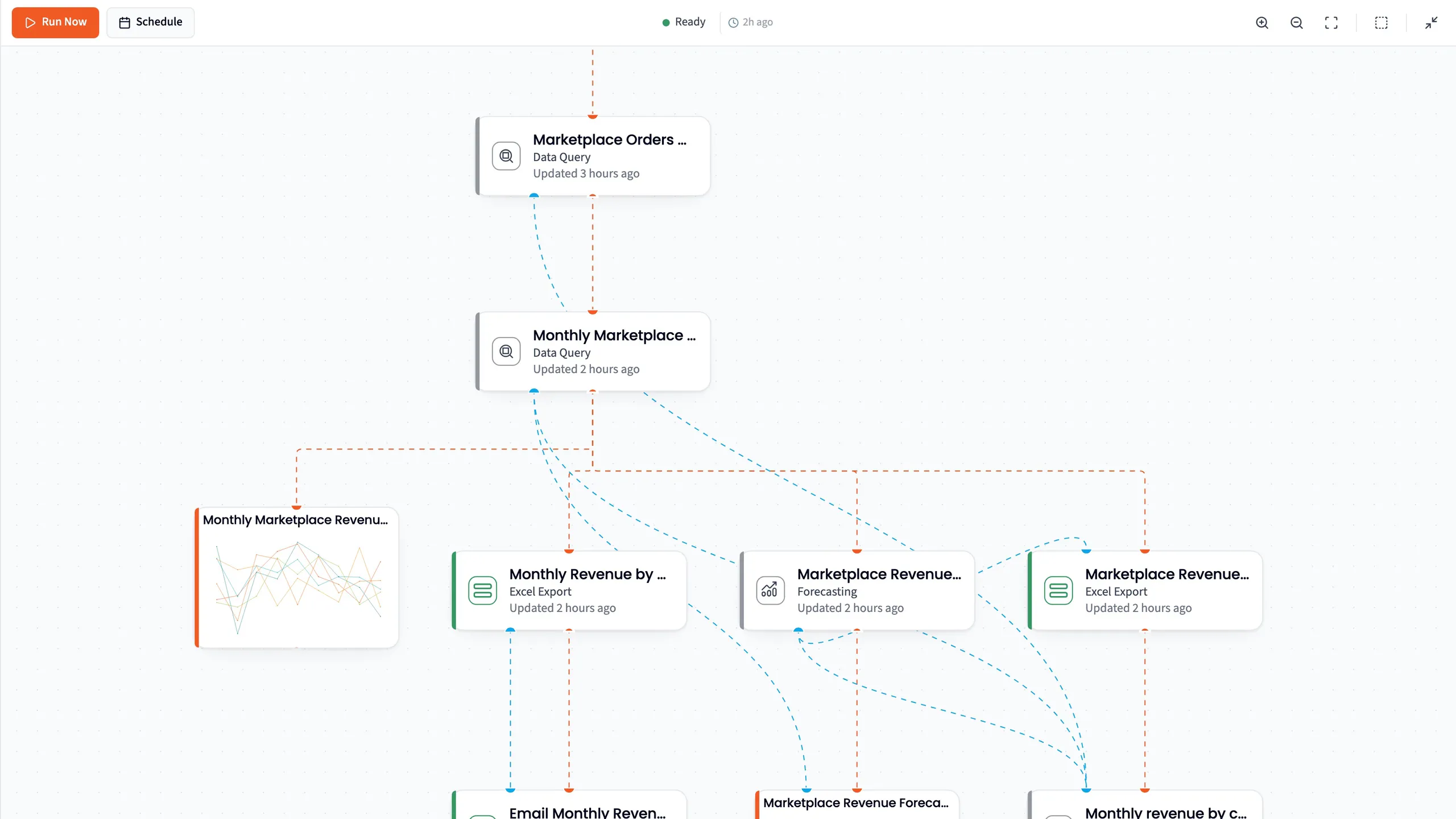
- A Visualization step: the chart’s step, with a small picture of the chart.
Changing a chart
Section titled “Changing a chart”There’s no chart editor in a project, so there’s no chart-type switch or settings panel. You change a chart by asking.
- Refine on the chart changes that step. Describe what you want, such as “Add a trend line”. Only that chart’s step runs again, and a refinement that works costs half a credit. See Refining a result.
- In the chat, ask for what you want next, such as “Make it a stacked bar by channel”.
Downloading a chart
Section titled “Downloading a chart”Download on the card saves the chart as PNG or SVG. If the chart has no picture yet, it says “Image downloads not available yet”. For several charts at once, select their steps in the Data Flow and click Download for a ZIP of PNGs, with each step’s data as CSV.
When a chart doesn’t load
Section titled “When a chart doesn’t load”Chart Failed to Load means the chart couldn’t be drawn from its data, and Retry tries again. While a chart step is still running, its card shows an empty chart outline. If the step itself failed, see When a step fails.